 Dieser Artikel ist Teil des ScienceBlogs Blog-Schreibwettbewerb 2017. Informationen zum Ablauf gibt es hier. Leserinnen und Leser können die Artikel bewerten und bei der Abstimmung einen Preis gewinnen – Details dazu gibt es hier. Eine Übersicht über alle am Bewerb teilnehmenden Artikel gibt es hier. Informationen zu den Autoren der Wettbewerbsartikel finden sich in den jeweiligen Texten.
Kurzer Hinweis: Dieser Artikel entstand im Rahmen eines internationalen Workshops zum Wissenschaftsbloggen den ich kürzlich in Bremen gehalten haben. Die Sprache des Workshops ist englisch weswegen auch dieser Text auf englisch verfasst wurde. ——————————————————————————————————————
A map is a map is a map?
by Mara Ort
My name is Mara, and I am currently working on a PhD on coastal infrastructures in New Zealand. I studied Geography and I am interested in all kind of relations between people and the environment.
Maps are usually used without much thinking about who made them and why, and as long as they look “official”, we believe what they show us. But are maps really objective and neutral depictions of the world?
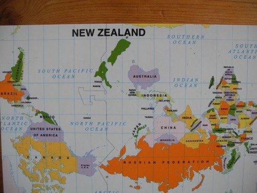
On a trip to New Zealand, I was strolling through town and entered a shop to buy some postcards for friends and family back home. On the rack where the cards were on display, I found one showing a really strange world map:
North was at the bottom! Moreover, Europe was not in the middle! Something certainly went severely wrong here…. The map I saw messed around with the more predominant depiction of a world map, it was “upside down” and showed the Pacific in the centre of the map. Is there a sign in the Arctic saying “Top. Please do not turn upside down”? And who decided that Europe is the centre? Usually, we tend to think that maps are objective, that they depict “reality”. We get used to a common representation of the world map. And isn’t it the experts who produce the maps anyway?
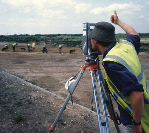
A surveyor at work. (Image: Wessex Archaeology CC BY-NC-SA 2.0)
But would you really believe these people wearing silly hats and high-vis vests? Well, maybe not only because of the hat. Nevertheless, what I think is important here is to keep in mind that maps are made by human beings and institutions. I guess the people who produced this map also thought that it’s quite accurate and shows the world how it is:
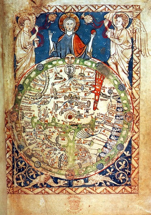
London Psalter Map, appr. 1200 AD (Public Domain)
Some 800 years ago, this is how certain people in Europe saw the world. It reflects the knowledge of that time, the prevailing religion of the society (Christianity), and also where the map comes from (Europe). How a map is made and what it depicts can be influenced by all kind of social, political or cultural conditions. And like nowadays the logo of a cartography department suggests correctness and objectivity, I imagine in the Middle Ages you just added some angels to your map and people went “This map seems to be alright, eh”.
„What you get is what you see (on a map)“
If we relate this line of Tina Turner to maps, we cannot really agree with her on this statement. Rather, what you see on a map is just a selection of things made by some person or institution, so you can get many other things as well. So it would have to be „What you see on a map is what someone else put down“. Not really a catchy line for the chorus….
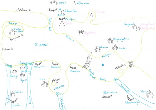
So let’s have another look at how maps can look like. Another thing I did in New Zealand (next to buying postcards) was fieldwork for my PhD project. When I interviewed a resident of the city of Tauranga, I asked him if he would draw a map of the area for me. My interview partner was Maori (indigenous people of New Zealand). In his map, he drew meeting houses (marae), old villages (pa) as well as rivers and hills, which play an important role for the culture of the Maori. If we compare his map to the one we get from Open Street Maps for the same area, they look quite different:
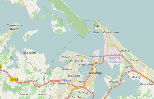
Map of Tauranga City and surroundings, New Zealand (Image: Open Street Map)
Whereas my research participant was drawing sites of cultural importance, on the Open Street Map we have mainly streets and settlements structuring the map. Even the names for features we find on both maps are often different, like Mauao called Mount Maunganui in English. These two maps show us how the same section of the earth’s surface can be perceived and mapped in very different ways.
So in my opinion it is worthwile to keep in mind that maps are not at all “neutral” or “objective” representations of space. Rather, they are highly political, filled with norms, values, and beliefs, embedded in historical developments and influenced by the origins of their makers. I still have the postcard with the “upside down” world map to remind me of this from time to time…





Kommentare (38)